Interactive Dashboards Provide Real-Time Visibility
Get the information you need to better support your teachers, providers and students in one simple dashboard.
Visibility into your district’s data
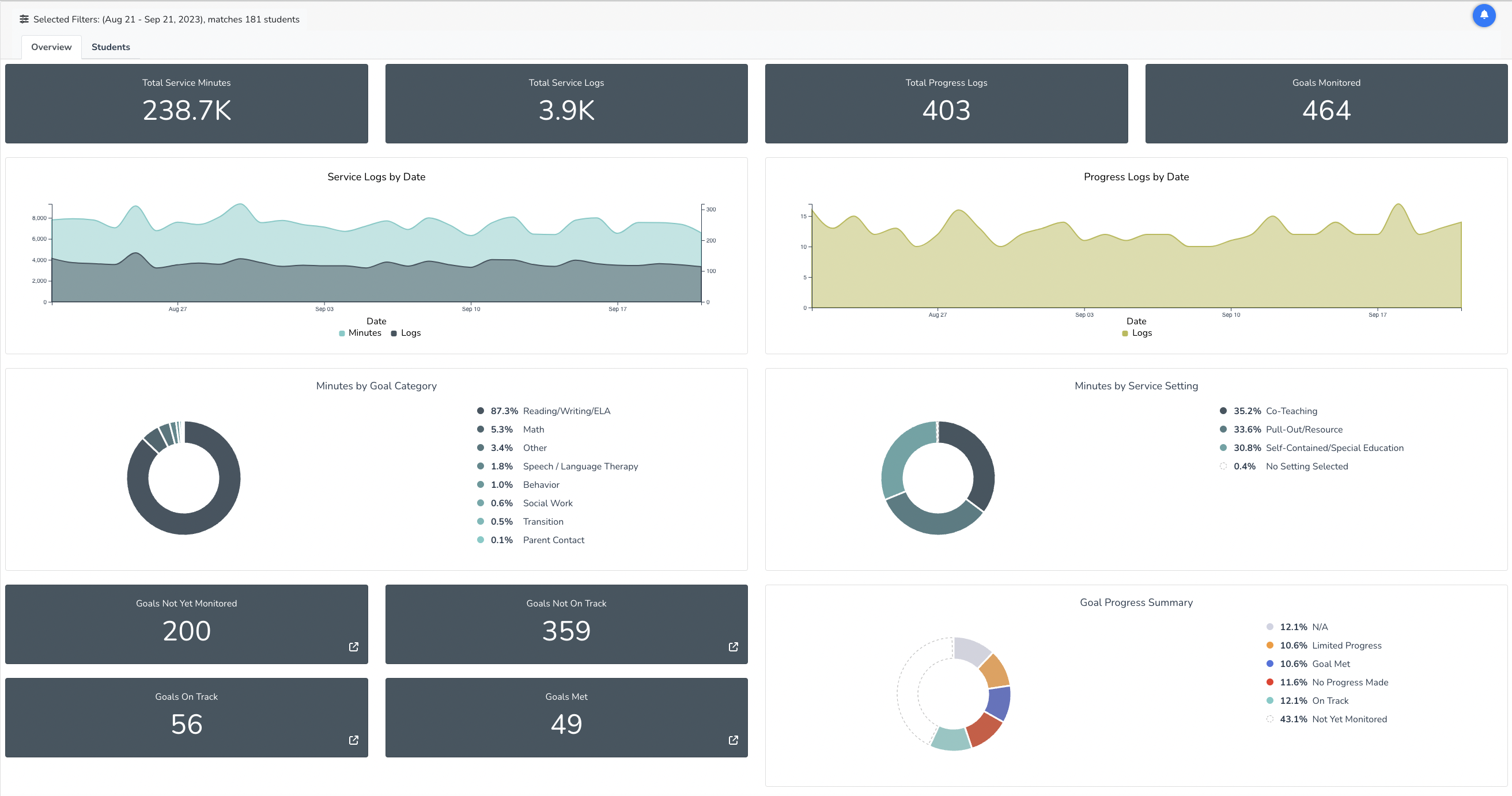
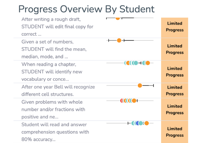
Uncover important information at-a-glance in an interactive dashboard. Choose to view aggregate data from your whole district or use filters to get a quick look at specific data. Administrators can quickly identify students not on track to meet their goals and explore additional services and support.
Visibility into your district’s data
Information as detailed as you need it
Information as detailed as you need it
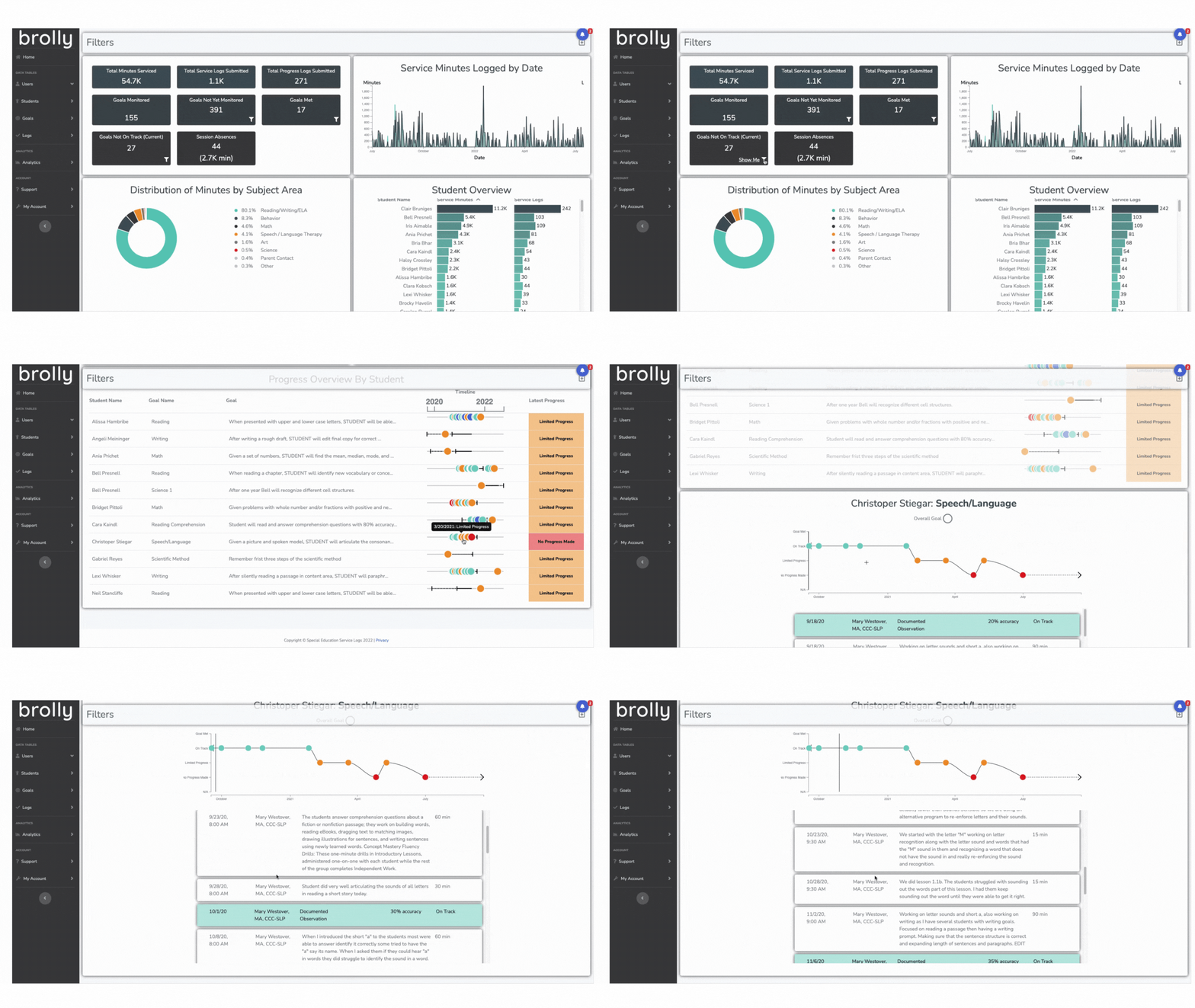
See each student’s services sessions and progress in a chronological list to better understand the context and modify approaches when needed. With this information, leaders can proactively identify trends and make adjustments to improve student achievement.
Transparency empowers a proactive approach
If you selected a student at random, how long would it take to get a pulse on their services, progress and attendance?
Spreadsheets do not create transparency. You need real-time visibility to efficiently identify issues and provide teachers and providers the support they need.
Transparency empowers a proactive approach
“Brolly has been instrumental in ensuring that our students receive the services they need.”
"The platform and its team have transformed how we track and report on IEP services, building capacity and confidence among our staff.”
If you like the dashboards, you’ll love the reporting center
